
Styleguide
Learn about Curvo's design and download the brand assets.
Colours
Logo
Primary

The width of the primary logo should not scale down below 25mm in print and 75px on screen.
Secondary

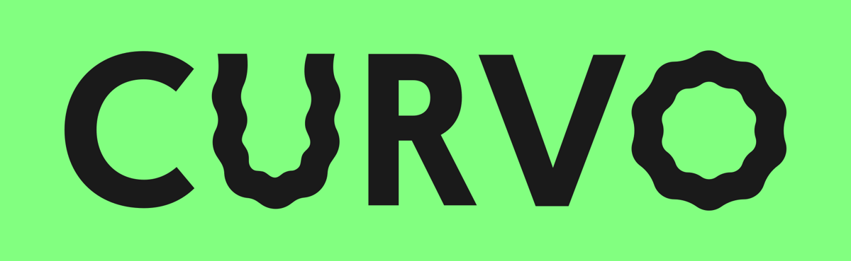
When necessary, the secondary logo without the curves can be used. For instance, when the tone needs to be more serious, when the background is too busy…
Animated logo


Colours
Prefer these combinations for the logo, text and main brand declinations. On white or colored backgrounds, the logo and text should be charcoal. They should be white on dark backgrounds.



Typography
Curvo uses Basis Grotesque.
Heading H1
Heading H2
Heading H3
Desktop
Primary Header
Secondary Header
Text
Mobile
Primary Header
Secondary Header
Text
Lists
Bullet list
- Bla bla bla
- Bla bla bla
- Bla bla bla
Numbered list
- Bla bla bla
- Bla bla bla
- Bla bla bla
Quotes
An investment in knowledge pays the best interest.
The pension crisis is actually just a crisis of the financing of pensions. There is simply not enough money in Belgium to continue to pay the rising pension burden.
Tables
Forms
Page title
With image
A better way of saving money
With video

Invest your savings smartly
Paragraph with image
Hi 👋
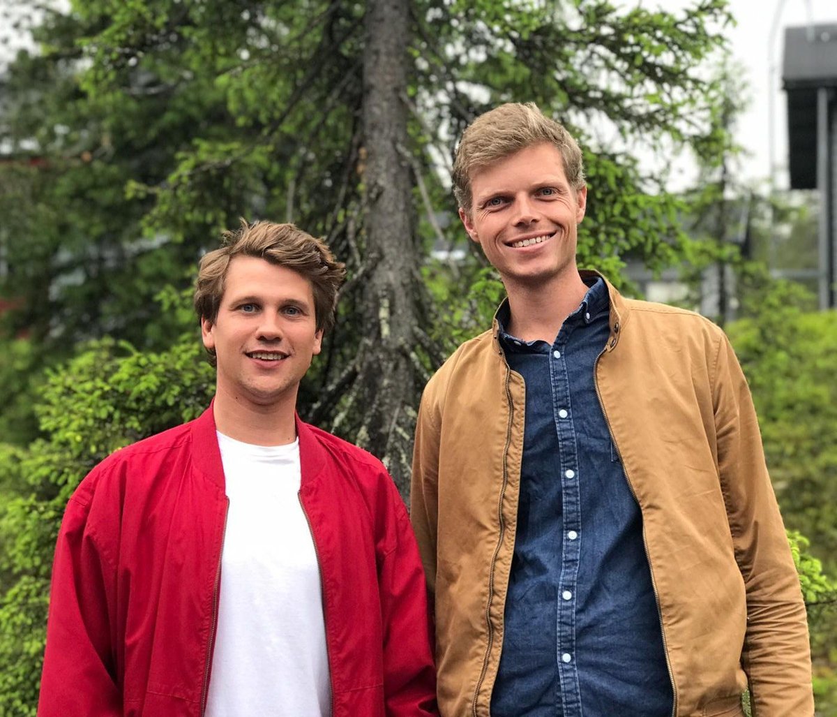
We’re Thomas & Yoran.
We’ve been putting money away for a long time. Like everyone else, we keep our money in a savings account. Yet every year, the low returns are disappointing us. The money is sitting there, so there has to be a better way.
We asked our bank, scoured the web, searched far and wide but we couldn’t find what we were looking for: a way to make money from our savings. Instead all we found was jargon, complicated financial “solutions”, horrible stock photos of old men in suits and clunky apps. No thanks. We didn’t feel that they offered a product built for us and our generation.
That’s why we started Curvo. We know we’re not alone.